
Vote On Our 2008 Holiday Card
By / /
Thanks to everyone who submitted a holiday card in our reader design contest this year. We’ve made our five selections (we’re feeling generous). Please be selective in your voting for the winner. The final card will be sent to the entirety of our contacts list, multiples of thousands of people within the creative industry – and we’ll give the creator credit for it. Commence voting (it closes Friday night)!
Entrant #1: Website (click through to the site)
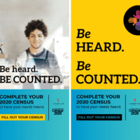
Entrant #2: Traditional Card (click through for larger view)

Entrant #3: Ad-ish Card (click through for larger view)

Entrant #4: Traditional Card (click through for larger view)

Entrant #5: Poster-ish Card (click through for larger view)


Comments
gordy December 19, 2008
2! Great creative
2! Great creative motherfuckers!
Eric December 19, 2008
2
2
Pauline December 19, 2008
#2. It so captures the
#2. It so captures the Egotist. Bravo.
PalmerPolanski December 19, 2008
2 is the best . The rest a
2 is the best . The rest a horrible.
Jeremy Greenfield December 19, 2008
2
2
Andy Jukes December 19, 2008
They all have their charms,
They all have their charms, but I have to agree on #2.
Andrew Hoffman December 19, 2008
#1 (My vote is is a little
#1 (My vote is is a little bias, but #2 is pretty sweet)
PalmerPolanski December 19, 2008
Bad design on #1 + no color.
Bad design on #1 + no color. The last one is depressing. Mabe the Behance people would like it. LOL
Lynz December 19, 2008
#1 all the way
#1 all the way
Billy December 19, 2008
#1. Those Interactive holiday
#1. Those Interactive holiday cards. so hot right now. Interactive holiday cards.
Chris Lawson December 19, 2008
Any card that gets “fucking”
Any card that gets “fucking” on it gets my vote. #2 it is. #1 has some merit, but it’s hardly clever to say “just kidding” at the end. That’s like those shit movies that explain everything by saying it was all a dream. And having 4 frames saying “we don’t do holidays” is beyond ironic.
Justin McCammon December 19, 2008
#2
#2
Billy December 19, 2008
I don’t know what Palmer is
I don’t know what Palmer is talking about, the design of #1 is pretty dope. But I do agree with Chris, “just kidding” is pretty lame (it would have been cooler without the last frame). BUT my vote is still for #1…do you think the Egotist is really going to do a print job of a postcard and send it to “thousands” of contacts? Probably not. It would also be lame to attach a pdf to a email that says “Front” and “Back” on it. Here’s a tip for the kiddies: Presentation and execution is everything, know your client. peace out.
Angela December 19, 2008
#2
#2
Angela December 19, 2008
#1.
But I’m still shocked
#1.
But I’m still shocked that mine didn’t make the cut. Shocked!
Heather December 19, 2008
#1
#1
Dan Harman December 19, 2008
Billy, you’re missing the
Billy, you’re missing the point. #1 is a fairly pedestrian idea that was designed by someone who knows web skills. #2 is more intelligent and has The Egotist’s tone of voice bang on. I can easily see #2 being designed as a clickable card like #1, obviously the design was done by a writer, not a mac monkey. To say “presentation and execution is everything” is completely myopic and is the reason so much advertising looks like wallpaper these days. You need to grow up, kiddie. I vote for #2, it’s a much better idea. Just make it web-friendly guys.
Neil December 19, 2008
Wow, this thread is getting
Wow, this thread is getting more attention than agency of year.
Priorities people.
#2
Will December 19, 2008
Definitely #2.*
* I approved
Definitely #2.*
* I approved this message.
Dan December 19, 2008
#1
#1
Typothermia December 19, 2008
My vote is for #1. Why did
My vote is for #1. Why did #2 have to use that damn “Dakota” script font? That is up there with comic sans and papyrus on the worst fonts ever list. Concept and Creative is important…but don’t forget about the type. Typothermia.com is coming soon!
Zach December 19, 2008
#2
#2
Matt Williams December 19, 2008
It’s good to see the two
It’s good to see the two ideas that are actually ideas are getting fought over. Personally, I think #1 has the better design but #2 the better idea. If you get those two to bang their heads together you could have a decent card. I vote for #2, but it needs some work to be sent out electronically. And the handwriting should be handwriting, not a font.
Erikkk December 19, 2008
You mean copywriters and
You mean copywriters and designers working together, simultaneously? Crazy concept. But seriously the Hoff is one of the hardest working designer/traditional oil-painter/street artist/web developer I know, he would probably be up for it. My vote is for #1.
Lisa December 19, 2008
#3 It’s the only one that’s
#3 It’s the only one that’s not ridiculously proud of itself.
Denver Nights December 19, 2008
#4
#4
M.P. December 19, 2008
4. I won’t look at any more.
4. I won’t look at any more.
Biff "Mad Dog Tannen December 19, 2008
#1. I am a Mac
#1. I am a Mac Monkey…Butthead.
Nicole December 19, 2008
#1 is so awesome that its
#1 is so awesome that its awesomeness blinds me when I look at it.
Meghan December 19, 2008
#1 is my vote. Simply
#1 is my vote. Simply awesome.
ELC December 19, 2008
#3 It’s fun and they get it.
#3 It’s fun and they get it.
mandy December 19, 2008
#3
#3
jn December 19, 2008
#3
#3
Jeff December 19, 2008
#3
#3
Andre December 19, 2008
#3
#3
AppleZ December 19, 2008
3 is right on.
3 is right on.
MH December 19, 2008
#3
#3
DM December 19, 2008
tres por favor! (3)
tres por favor! (3)
Shaw Nielsen December 19, 2008
#3
#3
Clayton December 19, 2008
I think number 3 works the
I think number 3 works the best for the Egotist.
#3
Ryan Moede December 19, 2008
#1
#1
Bry December 19, 2008
#3
#3
claire December 19, 2008
dakota? ugh. i like #3.
dakota? ugh. i like #3.
Eric December 19, 2008
#3 makes me happy.
#3 makes me happy.
Thomas December 19, 2008
#1, it made me laugh. I like
#1, it made me laugh. I like the blown out menorah.
Media Rocks December 19, 2008
#2. Its got that…local flair
#2. Its got that…local flair to it.
You Nailed it December 19, 2008
Lisa,
“#3 It’s the only one
Lisa,
“#3 It’s the only one that’s not ridiculously proud of itself.”
Then it is the only one that doesn’t represent the attitudes of most Denver creatives. Way to nail it!
Scott Fassett December 19, 2008
#5
#5
John December 19, 2008
I wish #2 functioned like #1.
I wish #2 functioned like #1. Until then I vote D) None of Above
Trish December 19, 2008
#3 – the rest are expected
#3 – the rest are expected
ESPI December 19, 2008
numero two
numero two
Crawford December 19, 2008
#3!
#3!
dood December 19, 2008
#1 with #2’s content would be
#1 with #2’s content would be sweet.
Jesse December 19, 2008
#1! The others are not even
#1! The others are not even close, 2 is a good concept but the execution is crap. The other 3 are to predictable.
Sarah December 19, 2008
#1, you know how the egotist
#1, you know how the egotist roll, drinking rounds of beer at the end of the day and asking someone else to pick up the tab.
Erin December 19, 2008
#3
#3
wigz December 19, 2008
#2 rocks!
#2 rocks!
Dood. December 19, 2008
Duece. Bueller?
Duece. Bueller?
Duderino. December 19, 2008
Duece. I just voted twice.
Duece. I just voted twice. Who’s to say that these different votes are made by different people? I’m not saying, I’m just saying.
Lar December 19, 2008
You’re sending out a holiday
You’re sending out a holiday card that you neither concepted, designed nor decided on?
Nice.
Sjt December 19, 2008
…but posted
…but posted
Just a dude who abides December 19, 2008
Come ON! #1 ends with “just
Come ON! #1 ends with “just kidding.” That’s so fucking lame. I’ll go one better, how about “We don’t do Holidays…NOT.” Give me a break. #2 does have a crap execution but it’s still the best idea by a mile. #2 all the way.
andydut December 19, 2008
#2 must be good, it mentions
#2 must be good, it mentions CP+B
Rob December 19, 2008
I write copy and I’m voting
I write copy and I’m voting for #1. So “just kidding” and “cheers, we’d buy you a round, but seriously we have like 2 bucks.” is not the most clever copy. But it sounds like something I would say…in real life. Damn Ad people! Sometimes you need to break out of your sarcastic shell. Copy that a real person would say is a breath of fresh air. Why does everything always have to be “clever?” Try something different.
Chris Maley December 19, 2008
Uno.
Uno.
My vote is for #3 December 19, 2008
I’m still trying to figure
I’m still trying to figure out the knock against Colorado Springs with “Enjoy the festive season”. Can someone fill me in?
The Artistic Mercenary™ December 19, 2008
#2 ‘cause it’s your style.
#2 ‘cause it’s your style. All the rest have been done before.
B.Suter December 19, 2008
#2, if they replaced the
#2, if they replaced the hand-written typeface with actual hand-written type.
#3 is nice, too.
artoudeetou December 19, 2008
u go number two!
u go number two!
Rated Arrrgh December 19, 2008
#5 – no love for #5?
#5 – no love for #5?
Straight to the point headline with out all that “get it, we’re in advertising” crap of #2. Too bad # 1 ended weak.
a writer December 19, 2008
#1 – You don’t have to be
#1 – You don’t have to be witty and sarcastic to make me laugh my ass off. “Just kidding” is said by “Joe the plumbers” everyday. I hope you fall off your high horse by laughing at the genius of option #1.
MJH December 19, 2008
#1
#1
jay December 19, 2008
#1 is the most fun for me.
#1 is the most fun for me. and speaks closest to TDE. i would’ve like to see a different close, too. but it’s fun.
#2 is close and fun, too. but the cross out a message and put “revision quotes” has been done, friends. still, the writing and attachment to the community is fun.
nikki December 19, 2008
#1 is the bomb diggity –
#1 is the bomb diggity – yeah, i said it
Morris December 19, 2008
#1 – That shit is monkey.
#1 – That shit is monkey.
Jaime December 19, 2008
#1
#1
Cousin Eddie December 19, 2008
#2.
#2.
Patrick December 19, 2008
#1
#1
panerai December 19, 2008
3 is the obvious winner here.
3 is the obvious winner here. anything playing off how many holiday celebrations there are is as trite as a sport coat and a tight, clever t-shirt that your sister’s boyfriend makes in his basement in brooklyn. shouldn’t any ad person in the country or world be able to get these cards? 3 bitches.
jones December 19, 2008
3 3 3 3 3 – finally someone
3 3 3 3 3 – finally someone with some fresh thinking. i could use some of that cream for sure.
ad god December 19, 2008
my vote is with 3.
my vote is with 3. unfortunately it won’t win for the same reason that 30 rock is still on the air. if you don’t understand what i mean by that you probably laughed at the singing fish you got for christmas 2 years ago.
Trevor Smith December 19, 2008
#2
It’d make a great
#2
It’d make a great website page too.
Imagine the card scrolling down as each greeting is crossed off . . .
Charlotte December 19, 2008
#2
#2
hollie December 19, 2008
I vote #1. Interactive cards
I vote #1. Interactive cards are great.
Holla with an r December 19, 2008
#1
#1
Bahhh December 19, 2008
So, #2 had been done. But
So, #2 had been done. But #1’s “just kidding” crap is original. And if you take the last frame off, it’s completely pointless. Saying “we don’t do holidays” and sending out a Holiday Card is like shouting out “I’m on a vow of silence right now.” So there. I like #3’s idea, but it should be used as a DM piece for The Egotist, with actual jars of cream boxed up and sent to prominent journos. So, #2 gets me vote…if you jazz it up.
trk December 19, 2008
a vote for number one
a vote for number one
amanda December 19, 2008
#1
#1
Chester December 20, 2008
I like #3
I like #3
mark December 20, 2008
#1. I could never bring
#1. I could never bring myself to vote for a design that uses dakota, sorry copywriters but just like grammatical rules there are rules of design and voting for #2 is like voting for a concept that miss-uses a semi-colon.
Copyranter December 20, 2008
I’m a copywriter and I’d vote
I’m a copywriter and I’d vote for a design that bastardizes a semi-colon if the idea was sound. Copywriters, good ones anyway, care more about communication than perfect grammar. And here’s another thought…if you hate Dakota so much, how long would it take to change it to something else? Vote for the best concept, not the best use of type. Ideas are king. #2 for me.
PalmerPolanski December 20, 2008
Lets have a rally and take
Lets have a rally and take this to 100. I enjoy it!
Not Joe December 20, 2008
I hate that prick. If he says
I hate that prick. If he says “just kidding” I’m voting for #2 on principal
mark December 20, 2008
I would rather vote for an
I would rather vote for an entry that has a good concept and a great design, then a entry that has a great concept and a shitty design. A successful balance between design and concept is king. Another point is that this is a contest not a 1st draft comp, what you see is what you get and you don’t get a chance to make changes, why should this be any different from any other contest? Vote #1
Chris Lawson December 20, 2008
The Typothermia type Nazis
The Typothermia type Nazis are clueless. #1 does not have a good concept or a great design. They’re both average. #2 has a great concept and a poor design. I’d rather see The Egotist be known for a smart card, not an average one. Take 5 mins to sort out the design. I hardly think it’s fair that the winner will never be a writer’s entry because they don’t have Mac skills. On that score, #5 should win because the design is way better than #1.
Laid Off December 21, 2008
#1 for sure. Holidays sucks.
#1 for sure. Holidays sucks.
Michael Crouch December 22, 2008
#2 – Sterling Rice quote is
#2 – Sterling Rice quote is priceless.
3some December 22, 2008
3
3
Rad Writer December 22, 2008
#2, please.
#2, please.
The Mouth December 22, 2008
Numero two for me.
Numero two for me.
sj December 22, 2008
#4
#4
One December 22, 2008
1 more for #1
1 more for #1
Serious? December 23, 2008
Concepts pimp-slap design
Concepts pimp-slap design every, single day of the week. #2.
Let's Do This December 23, 2008
Two-two.
Two-two.
Laura December 23, 2008
2 is the only one that
2 is the only one that matters. 1 has been done to death, and 3 – 5 are just too art-school. 2 embodies the snarky, bitchy, insecure industry we love. Plus, if I could finally get MY agency to understand that I want THIS kind of totally-cheap-to-produce cleverness, it’d be wonderful.
Stu Alden December 23, 2008
#3 – but doesn’t need the
#3 – but doesn’t need the copy. anybody who reads the egotist would get it. say it or show it – not both…
sj December 23, 2008
i just think #2 is trying to
i just think #2 is trying to be too clever for its own good and it takes too long to get its point across. Its so long winded and in the end its saying that ‘have a great holiday’ is much better than ‘happy holidays’. whats the point?
Jonathan Pite December 24, 2008
#2, awreddy!
#2, awreddy!
Paul Suggett December 24, 2008
As the creator of #2, I have
As the creator of #2, I have a few things to say SJ. First, I’m no fan of visual puns, I like writing copy. No doubt Neil French’s work is way too long winded and clever for you (although I’m no Neil French…I wish). Second, the line inside says Have A Holiday, with the added bonus of an asterisked clause. It’s sarcasm. You can look that word up later. And third, which one was your entry? Or did you not bother?
sj December 24, 2008
the above quote is a direct
the above quote is a direct reason that #3 should have won. [and no i did not do #3, i did #4] Yea, yours is way too clever for me but luckily, i learned all about sarcasm on family guy. thank you for proving #3’s concept, which by the way, was the only one with a concept. its nice to see his/her point come across so perfectly with someone like you. if you learned to take criticism [you can look that word up later] you might be better off than you are now. Have a great holiday!*
*just kidding
Paul Suggett December 26, 2008
I’m just tallying the votes
I’m just tallying the votes for #4 right now. Hmm, that didn’t take long. I have no issue with criticism, I did my training in London. I can see your issue with clever though, yours was quite the opposite. Have a good career!*
*just kidding.
... December 29, 2008
which entry won?
which entry won?
Peter Gibbons January 4, 2009
Definitely No. 4… the others
Definitely No. 4… the others are self-conscious, angry, pretentious or safe.
... January 8, 2009
1 & 2 tied.
1 & 2 tied.